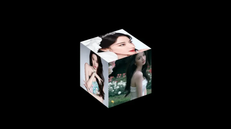
目录
本文只需简单的 HTML、CSS 来实现三维旋转动画相册,您将学习到的技术有:
- CSS3 3D 透视 perspective、空间变换 transform
- 动画 animation、定义关键字 @keyframes
- 定位 position、伪类 :target 的巧妙结合
效果图
3 步实现旋转相册
搭建三维(3D)空间舞台
body 内添加如下代码,结构:舞台,容器,旋转图片。注意:
- 图片尺寸比例最好一致,例如这里演示的所有图片比例均为 3:4
- 这里给 img 套一个 a 标签是为了后续更改图片背景用
<div class="stage-area">
  <div class="container">
    <a href="#"><img src="./img/1.jpg" /></a>
    <a href="#"><img src="./img/2.jpg" /></a>
    <a href="#"><img src="./img/3.jpg" /></a>
    <a href="#"><img src="./img/4.jpg" /></a>
    <a href="#"><img src="./img/5.jpg" /></a>
    <a href="#"><img src="./img/6.jpg" /></a>
    <a href="#"><img src="./img/7.jpg" /></a>
    <a href="#"><img src="./img/8.jpg" /></a>
    <a href="#"><img src="./img/9.jpg" /></a>
  </div>
</div>- 设置舞台三维透视距离
- 设置容器为三维视觉
- 内容宽度即旋转图片的宽度
- 设置图片最大伸缩到自身宽度,这里说下 max-width:100% 与 width:100% 的区别,前者图片最大伸展到图片实际的宽度,后者伸展最大伸展到父级元素的宽度,也就是说如果父级的宽度超过图片的宽度后者会拉伸超过图片实际宽度导致模糊失真,这是响应式或做自适应时默认要设置的属性。
.stage-area {
  perspective: 800px; /* 透视距离 */
}
.container {
  transform-style: preserve-3d; /* 三维视觉 */
  width: 100px; /* 图片宽度 */
}
img {
  max-width: 100%;
}- 设置容器相对于窗口水平垂直居中,图片叠加在一起的效果。利用定位和负的margin来水平垂直居中确定宽度的块级元素。
- 设置图片绝对定位使得图片相互叠加,避免后续导致的DNA螺旋效果,也方便查看垂直居中效果。
.container {
  ...
  position: absolute;
  top: 50%;
  left: 50%;
  margin-top: -50px;
  margin-left: -50px;
}
img {
	...
	position: absolute;
}查看并未达到预期的垂直居中效果,图片也被裁剪。查看页面元素发现body高度为0,这是由于内容设置了绝对定位脱离了普通流而且块级元素的默认性质是宽度撑满,高度由内容高度决定。设置如下:
html, body {
  height: 100%;
}
.stage-area {
  ...
  min-height: 100%;
}- 设置图片旋转角度,一圈 360°,图片 9 张,所以每张旋转 40°
- container 设置了 preserve-3d ,它的直接子元素 a 是可以 3D transform 的,以前三维是可以透传的,img 也可以设置 transform。 由于最新标准,更严格,不允许透传,且自身长宽不能为 0,所以需要对 a 标签也设置 preserve-3d,且为 block,子元素 img 才能 transform 。
.container a {
  transform-style: preserve-3d;
  display: block;
}

.container a:nth-child(1) img {
  transform: rotateY(0deg);
}
.container a:nth-child(2) img {
  transform: rotateY(40deg);
}
.container a:nth-child(3) img {
  transform: rotateY(80deg);
}
.container a:nth-child(4) img {
  transform: rotateY(120deg);
}
.container a:nth-child(5) img {
  transform: rotateY(160deg);
}
.container a:nth-child(6) img {
  transform: rotateY(200deg);
}
.container a:nth-child(7) img {
  transform: rotateY(240deg);
}
.container a:nth-child(8) img {
  transform: rotateY(280deg);
}
.container a:nth-child(9) img {
  transform: rotateY(320deg);
}此时会有翻书的效果,如下:
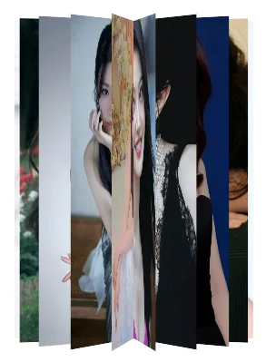
- 设置图片三维 Z 轴距离
.container a:nth-child(1) img {
    transform: rotateY(0deg) translateZ(200px);
}
.container a:nth-child(2) img {
    transform: rotateY(40deg) translateZ(220px);
}
...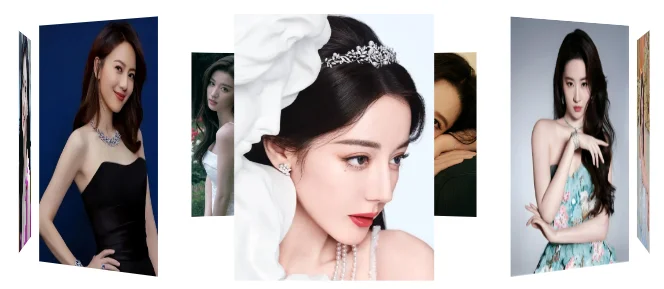
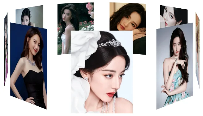
好了,一个三维立体的旋转相册出现了,但是感觉图片有点太高,有种仰视的感觉,可以让透视点高一点,产生俯瞰的效果。
- 调整透视点 perspective-origin
.stage-area {
	...
	perspective-origin: center 30%;
}
去掉图片 position 定位,可以看下DNA螺旋效果,后面动态旋转的时候可以倒腾看看。
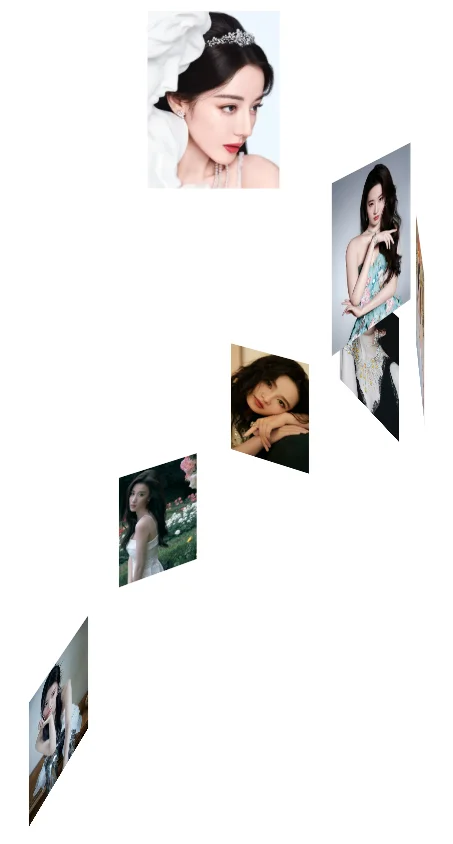
实现旋转动画 animation
接下来,让图片动起来,也就是绕着三维空间的 Y 轴旋转,这就得靠 @keyframes 设置关键帧和 animation 了。
| 属性 | 描述 |
| @keyframes | 定义关键帧 |
| animation | 所有动画属性的简写属性,除了 animation-play-state 属性。 |
| animation-name | @keyframes 定义的动画名称。 |
| animation-duration | 设置完成动画所花费的时间。默认值是 0,意味着没有动画效果。 |
| animation-timing-function | 使用名为三次贝塞尔(Cubic Bezier)函数的数学函数,来生成速度曲线。能够在该函数中使用自己的值。 |
| animation-delay | 设置动画开始前等待的时间,以秒或毫秒计。默认值是 0。 |
| animation-iteration-count | 设置动画被播放的次数。 |
| animation-direction | 设置动画是否在下一周期逆向地播放,单数次正向,偶数次逆向。 |
| animation-fill-mode | 设置动画在播放之前或之后,其动画效果是否可见。 |
| animation-play-state | 设置动画正在运行或暂停。 |
@keyframes rotating {
  0% {
      transform: rotateY(0deg);
  }
  100% {
      transform: rotateY(360deg);
  }
}
.container {
    ...
	/*animation: rotating 10s linear 3s infinite alternate forwards;*/
	animation-name: rotating;
	animation-duration: 10s;
	animation-timing-function: linear;
	/*animation-delay: 3s;*/
	animation-iteration-count: infinite;
	/*animation-direction: alternate;*/
	/*animation-fill-mode: forwards;*/
}DNA螺旋效果:
如果我们想鼠标移动到图片上,就暂停动画该怎么办呢?
- 设置 animation-play-state ,同时为了美观,给图片加个半透明小边框。
.container:hover {
    animation-play-state: paused;
}
.container img {
    border: 3px solid rgba(255, 255, 255, .5);
}实现点击旋转图片更换背景
还想更进一步,实现点击图片大图在背景显示效果,可以利用 position + z-index + :target 伪类来实现。修改页面元素:
  <img id="t2" src="./img/2.jpg" />
  <img id="t3" src="./img/3.jpg" />
  <img id="t4" src="./img/4.jpg" />
  <img id="t5" src="./img/5.jpg" />
  <img id="t6" src="./img/6.jpg" />
  <img id="t7" src="./img/7.jpg" />
  <img id="t8" src="./img/8.jpg" />
  <img id="t9" src="./img/9.jpg" />
  <img id="t1" src="./img/1.jpg" />
  <div class="stage-area">
    <div class="container">
      <a href="#t1"><img src="./img/1.jpg" /></a>
      <a href="#t2"><img src="./img/2.jpg" /></a>
      <a href="#t3"><img src="./img/3.jpg" /></a>
      <a href="#t4"><img src="./img/4.jpg" /></a>
      <a href="#t5"><img src="./img/5.jpg" /></a>
      <a href="#t6"><img src="./img/6.jpg" /></a>
      <a href="#t7"><img src="./img/7.jpg" /></a>
      <a href="#t8"><img src="./img/8.jpg" /></a>
      <a href="#t9"><img src="./img/9.jpg" /></a>
    </div>
</div>此时发现一个有意思的现象,图片外沿出现缝隙,我们知道谷歌浏览器默认会给 body 加了 margin ,img 设置了绝对定位但没设置top,left属性,给 body 添加 border 和 padding 发现图片定位于 body 的 content 区域边界,如果设置图片top: 0; left: 0;发现此时图片与浏览器窗口边界对齐。可以设置 body margin: 0 或 图片定位top: 0; left: 0;
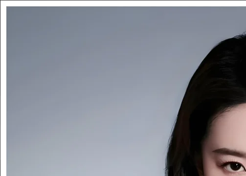
- 消除缝隙。
body {
...
margin: 0;
}我们要如何实现点击图片切换后面的大图呢?
原理:相册图片有 a 元素包裹,href 属性对应背景大图的 id,此时点击相册图片可以触发大图 :target 的伪类样式,由于图片都设置了 position 定位,可以设置图片的 z-index 来实现层级升降。之前定位图片是按顺序叠加的,有个小技巧,可以把首次要展示的图片放下面的位置。
- 降低非 :target 的图片的层级
body > img:not(:target) {
z-index: -1;
}至此大功告成。替换图片,就能制作你的女神的表白恋爱动画旋转相册啦。
想了解更多花式玩法,可以参考下一篇文章:如何制作 3D 立方体旋转相册。
<!doctype html>
<html lang="en">
<head>
<meta charset="UTF-8" />
<title>旋转相册</title>
<style>
@keyframes rotating {
0% {
transform: rotateY(0deg);
}
100% {
transform: rotateY(360deg);
}
}
html,
body {
height: 100%;
margin: 0;
}
.stage-area {
perspective: 800px;
min-height: 100%;
perspective-origin: center 30%;
}
.container {
transform-style: preserve-3d;
width: 100px;
position: absolute;
top: 50%;
left: 50%;
margin-top: -50px;
margin-left: -50px;
/*animation: rotating 10s linear 3s infinite alternate forwards;*/
animation-name: rotating;
animation-duration: 10s;
animation-timing-function: linear;
/*animation-delay: 3s;*/
animation-iteration-count: infinite;
/*animation-direction: alternate;*/
/*animation-fill-mode: forwards;*/
}
img {
max-width: 100%;
position: absolute;
}
.container:hover {
animation-play-state: paused;
}
.container img {
border: 3px solid rgba(255, 255, 255, 0.5);
}
.container a {
transform-style: preserve-3d;
display: block;
}
.container a:nth-child(1) img {
transform: rotateY(0deg) translateZ(200px);
}
.container a:nth-child(2) img {
transform: rotateY(40deg) translateZ(200px);
}
.container a:nth-child(3) img {
transform: rotateY(80deg) translateZ(200px);
}
.container a:nth-child(4) img {
transform: rotateY(120deg) translateZ(200px);
}
.container a:nth-child(5) img {
transform: rotateY(160deg) translateZ(200px);
}
.container a:nth-child(6) img {
transform: rotateY(200deg) translateZ(200px);
}
.container a:nth-child(7) img {
transform: rotateY(240deg) translateZ(200px);
}
.container a:nth-child(8) img {
transform: rotateY(280deg) translateZ(200px);
}
.container a:nth-child(9) img {
transform: rotateY(320deg) translateZ(200px);
}
body > img:not(:target) {
z-index: -1;
}
</style>
</head>
<body>
  <img id="t2" src="./img/2.jpg" />
  <img id="t3" src="./img/3.jpg" />
  <img id="t4" src="./img/4.jpg" />
  <img id="t5" src="./img/5.jpg" />
  <img id="t6" src="./img/6.jpg" />
  <img id="t7" src="./img/7.jpg" />
  <img id="t8" src="./img/8.jpg" />
  <img id="t9" src="./img/9.jpg" />
  <img id="t1" src="./img/1.jpg" />
  <div class="stage-area">
    <div class="container">
      <a href="#t1"><img src="./img/1.jpg" /></a>
      <a href="#t2"><img src="./img/2.jpg" /></a>
      <a href="#t3"><img src="./img/3.jpg" /></a>
      <a href="#t4"><img src="./img/4.jpg" /></a>
      <a href="#t5"><img src="./img/5.jpg" /></a>
      <a href="#t6"><img src="./img/6.jpg" /></a>
      <a href="#t7"><img src="./img/7.jpg" /></a>
      <a href="#t8"><img src="./img/8.jpg" /></a>
      <a href="#t9"><img src="./img/9.jpg" /></a>
    </div>
  </div>
</body>
</html>